

A bar graph that's worth 1000 words
#SciComm life hack: data visualization

We’ve talked a lot about using visuals to communicate science (or anything, especially complicated things) clearly and effectively. As the saying goes, “A picture can say 1000 words.”
From a scientific perspective, the brain’s visual system takes up the most space of any of our five senses. The outer layer of our brain, the cerebral cortex, performs high-level processing of what we perceive of the world around us. More than half of our cerebral cortex deals with the visual system. So, it makes sense to leverage our natural inclinations in storytelling.
In this issue of the Fancy Comma newsletter, Kelly talks about how to use bar graphs to visualize data. (If you’re interested in learning more about interpreting data charts and graphs, Kelly’s also written a two-part series about that on our blog.)
USING BAR GRAPHS FOR DATA VISUALIZATION
According to Forbes, “90% of information transmitted to the brain is visual…and visuals are known to improve learning and retention by 400%.” Things like charts, graphs, and diagrams are pictures to represent statistical proportions. They are also called “data visualizations.”
Charts, graphs, and diagrams can be used to create powerful infographics. Infographics are collections of data visualizations to create a visual story explaining something. An article in the Academy of Educational Leadership Journal found that students responded favorably to infographic-based learning. Thanks to infographics, the students also performed better academically.
Bar graphs are among the most common and simplest type of data visualizations out there. They come in various formats depending on your preferences and the data you need to display. Keep reading for an overview of the main types of bar graphs and some tips on building bar graphs into your writing using Microsoft Word.

Make data visualizations (charts, graphs, etc.) easy to understand
Whether you’re using a bar graph or other type of data visualization, make sure that people can easily understand the information you are conveying. Keep it as simple as possible. Focus on the most important elements needed for your reader to understand your topic — two or three key variables at most.
Let’s say that you are talking about the relationship between poverty and internet access. Your data visualization should show only those factors. In other words, it should show only the number of people with (or without) internet access, among people of varying socio-economic classifications. You’ll also want to make sure that the categories you show are simplified. Use simple language to label your X and Y axes. Make sure that anyone reading your visualization can understand it — even without surrounding explanatory text.
If you’re making a graph to show the relationship between poverty and internet access, you can divide your population into different socioeconomic classifications: lower class, working class, middle and upper class, for instance.
To illustrate other relationships, you can create additional data visualizations. You can create a new graph for the differences in internet access within socioeconomic classes by race, and another for differences between urban and rural communities.
Visualizing Data with Bar Graphs
What is a bar graph?
Bar graphs allow you to compare two or more groups. The bars in a bar graph can be vertical or horizontal. The length of the bars in a bar graph help you understand comparisons of magnitude.
Below is an example of a vertical bar graph, also called a column graph. I created this bar graph as an example for the purpose of the newsletter; the percentages here are illustrative only and do not reflect actual data.

Here, each bar represents the different socioeconomic groupings. The height or length of each bar represents what proportion of members of each group do or don’t have internet.
What are the types of bar graphs?
Bar graphs come in many different forms depending upon their orientation and the number of factors and type of data you want to represent.
Vertical. Vertical bar graphs, also called column graphs, are the most common bar graph. “Vertical” here refers to the fact that the measurement of the aspect of interest is displayed vertically along the side of the graph (along the y-axis). The bars rise from the bottom and the height indicates the differences between groups.
The bar graph I showed you above, which I’ve created for illustrative purposes only, is an example of a vertical bar graph. Here it is again:
Horizontal. Horizontal bar graphs have horizontal bars. The measurement of the aspect of interest is displayed horizontally along the bottom of the graph.
Here is an example of a horizontal graph (again, this is not real data - the graph here is for illustrative purposes only).

Stacked. Stacked bar graphs are useful if you want to break your main grouping up into smaller subgroups to show the proportion of those in each subgroup who fit a particular characteristic. Stacked bar graphs break up each bar to show values for each subgroup within the larger group. In the example we have been using, you could use a stacked bar graph to show the racial distribution of internet access across in each socioeconomic class. In other words, among those with internet access in each socioeconomic group, what proportions belong to each racial group.
Here is an example of a stacked bar graph (remember, these figures are for illustration only and do not reflect actual data):

Building simple bar graphs using Microsoft Word
It’s easy to create a bar graph using Microsoft Word. (If you’re already cool with bar graphs in your life, just keep scrolling to the “What we’ve been reading (and writing)” section.
Part One: Inserting a bar graph
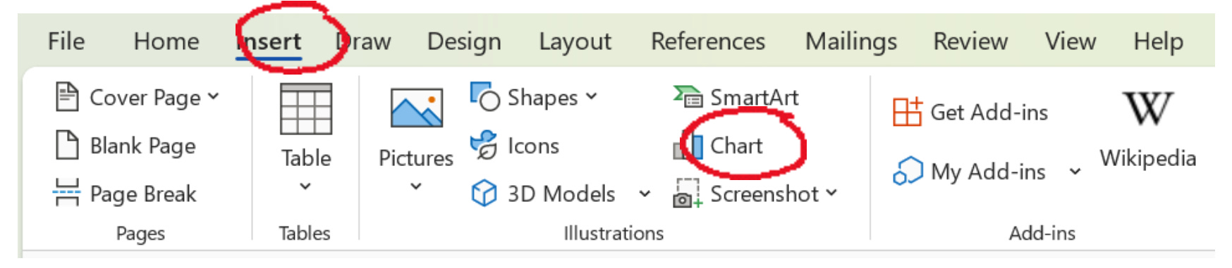
First, click the “Insert” option on the menu bar and choose “Chart.”
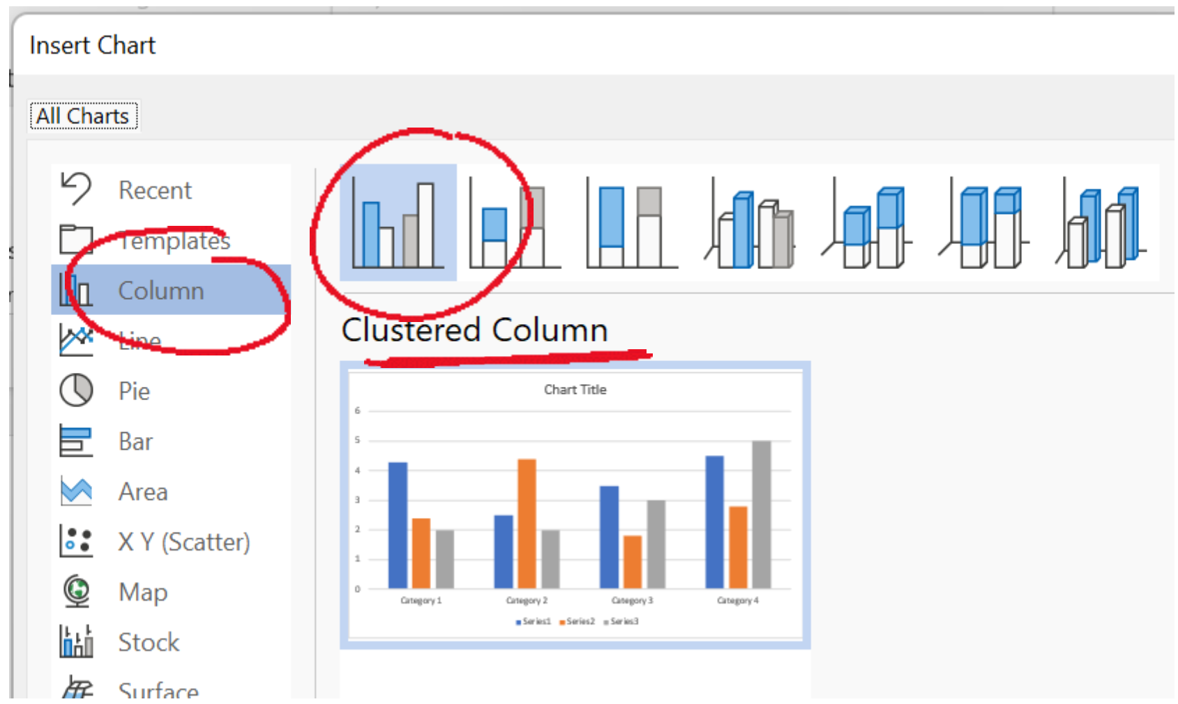
You’ll need to choose which kind of bar chart you want to create. You can create either standard or stacked bar graphs, whether horizontal or vertical.
Vertical or “column” bar graphs in Microsoft Word
To insert a standard vertical bar chart select “Column” from the “Chart” options. Choose the first chart option of “Clustered Column.” Then click “OK.”
To create a stacked vertical bar chart, select the “Column” option, then the second bar chart shown: the “Stacked Column” chart. Then click “OK.”

Horizonal bar graphs in Microsoft Word
To insert a standard horizontal bar chart, select “Bar” from the from the “Chart” options. Next, select the first graph option of “Clustered Bar.” Then click “OK.”

You can also create a stacked horizontal bar chart. To do that, go to the “Bar” option, and choose the second bar chart shown: the “Stacked Bar.” Then click “OK.”

Part Two: Formatting a bar graph
After you choose your graph type, a screen will pop up with prepopulated data points. It will look something like this (here, I selected a vertical bar graph).

Microsoft Word automatically creates a data table, complete with placeholder text/data. You’ll need to replace this information with your data.
Let’s update the labels first. The Category #s each represents a group label. In other words, they represent the different categories of bars. You can click on each category label to type in your own label.

For the example I used throughout this guide, about socioeconomic status, these labels were as follows:
“Category 1”: Lower Class
“Category 2”: Working Class
“Category 3”: Middle Class
“Category 4”: Upper Class
Here they are added to the data chart.

Next, it’s time to update the labels for your measurement of interest. Replace the label “Series [#]” with the label for your measure of interest. For the example of a simple bar graph I showed you at the beginning, we will only use one series, titled “Internet Access.” If you are only using one variable, you will only need one of the “Series” columns. Only label “Series 1” and delete the other columns.
Next, input your data. You can input raw amounts or proportions. In the example used in this guide, the values were a proportion measured as percentages (of those with internet access in each socioeconomic group, or class).

Here’s the original bar graph example from the beginning of this newsletter, for reference:
Remember that you can also create a stacked bar graph. Here’s what that looked like from earlier on in this post.
If you are creating a stacked bar graph, you will need to keep and label the other “Series” cells. Your labels here should indicate both the subgroups you are looking at and what characteristic you are interested in.
In the example used in this guide for the stacked bar graph, the subgroups were racial groups: "White," "Black,” and “Hispanic” and the characteristic of interest (being measured) was “Internet Access.” Each section of the bars represents the proportion of those in each socioeconomic group who had internet access and who were members of each racial group. The example graph indicates that 55% of those in the lower class with internet access are white.

You can further customize your chart design once you’re done inputting your labels and data. If you double click on your bar graph, you will see two options appear on the menu bar: “Chart Design” and “Format.”

In the “Chart Design” selection, you can choose your chart format, background and color scheme. Select “Change Colors” to change the colors of your bars.

Furthermore, you can change the orientation of your chart, type of chart, or data in your chart in the “Chart Design” menu. You can also use “Edit Data” to change the values or labels. “Change Chart Type” will allow you to morph your bar graph into a different kind of data visualization such as a pie chart or scatterplot (plot or dot graph). We’ve previously blogged about different types of statistical figures, and best practices to interpret them, on the Fancy Comma blog.

You can format the axes of your bar graph to change the range of measurement. Set the minimum and maximum values for your measurement by right-clicking on the axis that contains them, then select “Format Axis.”

Once the “Format Axis” box opens on the right of your screen, select “Bounds” to change the minimum and maximum values for your measurements. I suggest choosing values that are above or at your highest value. Here, I chose a maximum value of 1 since the highest percentage on the graph was 100%.
The “Units” option allows you to choose the intervals displayed in your measurement axis. In the graphs used in this guide, the units were shown at increasing intervals of 20% (0%, 20%, 40%, 60%, 80%, and 100%) — represented here as 0.2.

Finally, remember to label your axes! This way, people will quickly be able to gather what you are talking about in your graph. To do this, click on your graph to open a selection of options along the right of the graph. Among those options choose the “+” icon to open up a list of “Chart Elements” that you can edit. To add labels to the bottom or side of your graph select “Axis Titles.” Here, you can choose to add labels to your horizontal or vertical axis.
I encourage you to open Microsoft Word and play around with the bar graph settings. There are many options to customize your data visualization and, in doing so, to make your graph easier to understand from a reader’s perspective.

The bottom line…
Data visualizations like bar graphs are a simple and effective way to share information in a meaningful and visually interesting way. Data visualizations significantly increase your audience’s comprehension and retention. The most important thing to remember when building data visualizations is that the point is to simplify information for your audience, so keep your graph clean and the data simple.
Thanks, Kelly! That was a lot of really useful information!
Here’s what we’ve been reading (and writing) lately:
It’s been an exciting month on the Fancy Comma blog. I (Sheeva) published a seven-part series on how I got involved in politics as a scientist. We also interviewed Siri Carpenter, co-founder of The Open Notebook! Shoutout to Aimen, our social media person, who has been interviewing science communicators for our SciComm Conversations series. :) If you’d like to be featured on our blog, please get in touch!
“Message whisperer” and strategist Tamsen Webster helps you answer the question: “What do you do?” This is always a tough question for freelancers, and science freelancers especially. Shouldn’t we be working in a lab or something rather than hunched over our laptops, obsessing over the right word choice to explain something? Sidenote, I have a tough time knowing what I do sometimes. Am I a scientist? A writer? The answer is that I am both, but I definitely do not feel like a scientist or a writer most days when I am working. Can you relate? Feel free to chime in by commenting below or tweet at us @FancyComma.
Learn about how to work with your ideal clients over at Andy Strote’s blog.
Listen to Molly McPherson’s take on preparing for a last-minute media interview.
I loved Writing in the Dark’s blog that provided 11 pieces of advice for nonfiction writers.
That’s it for this week’s newsletter! If you liked it, please share it with your friends. Feel free to get in touch with questions you’d like answered in future newsletters.
Wishing you a happy and healthy holiday season and a Happy New Year!